Wednesday, November 11, 2009

Artist Lecture, Attie, Kerry McDonnell

The Attraction of Onlookers, Video Still, Shimon Attie, 2006


The Attraction of Onlookers, Video Still, Shimon Attie, 2006

The Attraction of Onlookers, Video Still, Shimon Attie, 2006

I had a really hard time taking Shimon Attie’s work seriously for a number of reasons. For one we had a lot of technical difficulties with his slides and the projector and he was very unprofessional about addressing the mishaps. He never failed to condemn the utilities available to us and how they’re insufficient for showing his work. I also thought he spoke very highly of himself and down to the audience. I was almost offended listening to him speak to us and as well as about his work. Overall his demeanor was not charming and he seemed very unapproachable.

His more recent work was interesting, but I was distracted by the ornamentation of his presentation; videos of his work introduced by poems that he wrote along with an established Welsh writer and the credits that scrolled beforehand was all very dramatic and theatrical and frankly, quite comical. As I said, I had a very hard time taking him and his work seriously. His piece The Attraction of Onlookers which focuses on the Aberfan, was presented this way. It was a tragic avalanche accident in a small village in Wales where all of the village’s children were killed, as the avalanche collided with the town’s only school. It has become a center for disaster tourism and Attie strove to create work that would normalize the town and its people. He hoped it would serve as a means to help the populous to overcome such an event. The Attraction of Onlookers is video work in which live persons are filmed in frozen poses on an invisible rotating stage. He wanted the viewer to be able to examine and observe these people, much like how their town became like a fishbowl after the incident. He also wanted to illustrate the effects of trauma with the frozen poses. Attie wanted to depict the kind of people who lived in every Welsh village; “Every Welsh village has a...,” and while he wanted to universalize these people and make them relatable, I don’t think he did it positively. It seemed to me that he was stereotyping these people. When speaking about this piece, I felt like the way he was talking about it suggested he was making fun of the kind of people who exist in a Welsh village. I felt like he was isolating them even more and maybe even being slightly disrespectful.

One thing I connected to during the lecture was his discussion of memory as a substantial thing to the person who the memory belongs to, yet it is not physical enough to grasp and an unsatisfactory way of being able to truly re-experience something. I’m not entirely sure what it was in relation to as it was a tangent off of another subject, but nevertheless I found it interesting to consider within my own work.

Shimon Attie: Between Dreams and History

MoCP

MoMA

Idea Blog for 11/12

Perfume 01, 11x14", Digital Photograph, Kerry McDonnell & Patrick Phillips, 2009

Perfume 02, 11x14", Digital Photograph, Kerry McDonnell & Patrick Phillips, 2009

Patrick and I have taken it upon ourselves to go into the studio and shoot! We’ve actually had quite a lot of fun and have produced some interesting work. It’s nice to be able to get away from working on “artsy” stuff and just experiment. We’ve been doing mostly product photography thus far but hope to move into shooting models within a week or two. This is a really great opportunity to let our creative juices flow freely and just create without having to think too much about what we’re doing. We’ve had a lot of happy accidents which has pushed us to experiment more and to make work what we have at hand. Not to mention, this helps out with my 150 images as well as reinforce everything I’ve learned in studio over the past year and half. It’s also interesting to think of this as another portfolio.

Last week we shot Patrick’s bike on a whim because we both forgot to bring things to shoot. We got the lighting set up and shot quite a bit within only an hour or so. What was so great was that we barely had to Photoshop anything out; only a wood block that was holding up the bike. This Monday I brought in a perfume bottle that we photographed for about 2 hours. At first we tried to emulate similar product shots you’d see in a magazine, but figured we needed to make it our own. The bottle was sitting on this really wonky piece of frosted plexi-glass that seriously distorted the reflection. So, we worked with it. What seemed like endless trips to the water fountain to fill up 2 water bottles was totally worth it in the end. We used the water to further distort the reflection or to just get rid of it. We also really enjoyed working with an element that’s somewhat uncontrollable.

Patrick and I have planned to alternate ideas-one day he’ll bring in something and the next I will. It’s great being able to act as the art director one week and the photographer the next. Since senior portfolio doesn’t meet that often it also gives us an opportunity to discuss and interact and bounce ideas off one another for a few hours a week. It’s such a drastic change from seeing your classmates everyday to barely once a week. This is a great exercise for both of us and allows us to hone our technical skills along with exercising conceptually in senior portfolio.


Sunday, November 8, 2009

Artist Blog 11/09

The Man Who Was't There (2000, Joel Coen), Digital Composite, Brendan Dawes, 2004

The French Connection (1971 William Freidkin), Digital Composite, Brendan Dawes, 2004

Vertigo (1958, Alfred Hitchcock), Digital Print, Brendan Dawes, 2004

Brendan Dawes is an interactive (graphic) designer based in Manchester, England where he works as the Creative Director for an interactive design company called magneticNorth (mN).

Brendan correlates his interest in computers and graphic design to his love of video games as a child and the hours he spent playing them at arcades near his home. On his website, he lists a handful of computers that he owned growing up and their profound functionality for the time. However, Dawes stated that most of the schools back then greatly underestimated the impact computers would have. Unfortunately he did not pursue a career in computing, but graduated school with a GCSE in art. He joined a local freelance photography agency where he mostly shot news stories found in local papers, which he would photograph and try to sell to the regional papers. Occasionally-given the success of the story-he would try to sell them to the national newspapers.

Upon discovering Mac computers and Adobe Photoshop, Dawes became interested in creating websites. He explains that he set out looking for source code on very early versions of websites-before you could even center text. He eventually created his first site about the original Outer Limits TV series. He used this site as a showcase for his abilities and landed a job with a web design company called Subnet. This was an experimental try at making web design a business, which actually took off. Some of the company’s clients were Disney and Fox Kids. After leaving that company, Dawes created several sites; one dedicated to the graphic design legend Saul Bass. The 2nd: a flash application that allowed you to edit together your own version of the Psycho shower scene. Upon seeing Hillman Curtis speak at a Macromedia Convention, Dawes was invited by Curtis to join him in a speaking engagement at Macromedia Web World in Seattle to talk about his sites.

After his Seattle trip, Dawes was then approached by his current employer, magneticNorth.

One of Dawes’ less interactive projects, Cinema Redux, he “explores the idea of distilling a whole film down to one single image.” This series is comprised of 8 pieces, each one of Dawes' favorite films from eight of his most admired filmmakers including Sidney Lumet, Francis Ford Coppola and John Boorman. He explains that each film is processed through a Java program that “samples a movie every second and generates an 8x6 pixel image of the frame at that moment in time. It does this for the entire film, with each row representing one minute of film time.”

John Walters of the Guardian discusses Dawes' work: “Film students, academics and obsessives with time on their hands may use Dawes’ grids to postulate new theories about the language of film.”

Each image allows you to see the editing styles of each director and the difference between films. It’s like viewing the DNA of each film, or perhaps a more direct window into the symbolism or the figurative and literal composition of each film. As I am contemplating ideas for presentation, this would be an interesting path to travel and it makes me wonder what taking a very long sequence of memory and distilling it to one image would say. And, like last week’s artist Martin Wilson, I can relate the general composition of my images to the overall composition of his distilled films; the many parts that make up one larger image.

In 2008 Cinema Redux was featured in the ground breaking exhibition Design and the Elastic Mind at the MoMA.

Cinema Redux
About Dawes

Thursday, November 5, 2009

Idea Blog for 11/05

Filmstrip 04 and details, 2x11", Digital Print, Kerry McDonnell, 2009

Filmstrip 05 and details, 1x11", Digital Print, Kerry McDonnell, 2009

One
Two

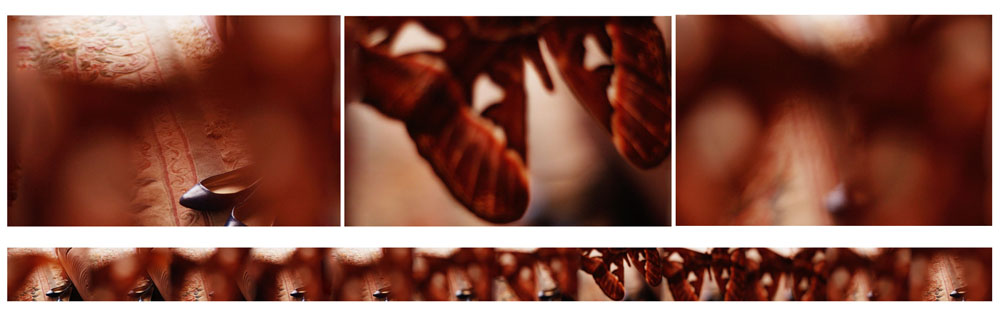
I have to confess that I haven’t had much time to photograph lately as I have been unable to go home and photograph my sister and spaces of my house. I have, however, done a few things around my house in Richmond. I have worked on making the moth clearer as well as shooting in a few spaces similar to those I’d shoot at home. After reviewing the video of my midterm critique I jotted down a few ideas from that as well as referenced some comments made on my midterm critique blog a few weeks ago. I’m a little confused as to where to go from here. At this point I feel like I’ve nailed down my aesthetic and now presentation is my big issue. I am absolutely considering making these into stop-motion films, but I’m not sure how much I want-or need-to deviate from my 3 midterm pieces.

A few things I jotted down were:

-Make the moth more obvious

-Make the filmstrips longer

-Swing focus back and forth more in each piece between moth and background. I think this could help in making the strips longer; I could swing the focus back and forth more and only have one point where the moth is blatant and completely in focus.

-If I choose to make these more current pieces into a film, I need to shoot the “beginning” and “end” frames so that they transfer more smoothly to show a continuous loop. I don’t want there to be any weird jumps between the end and beginning. That would, obviously, suggest that there is a specific linear narrative.

-I will also consider the relationship between background and foreground and experiment with what happens if the 2 blend at certain points.

Along with creating a stop-motion film I was considering organizing and displaying the filmstrips vertically, though I’m not sure what that might suggest. AND if they weren’t all exactly the same length I’d have an issue with what the composition of a group of vertical filmstrips would say.

Wednesday, November 4, 2009

Juried Contest Entries

Filmstrip 01 and details, 4x11", Digital Print, Kerry McDonnell, 2009
Filmstrip 02 and details, 8x11", Digital Print, Kerry McDonnell, 2009
Filmstrip 03 and details, 8x11", Digital Print, Kerry McDonnell, 2009


These are my other 2 show entries aside from the VMFA.
I entered a gallery containing the same images (+ details) as the Photographer's Forum for the MyArtSpace competition.


Sunday, November 1, 2009

Critique of Midterm Crit

It was incredibly uncomfortable watching the video of my midterm critique. I noticed that I wasn’t very engaging when reading my statement to the class. I probably could’ve looked up more or had more of the statement memorized. I also noticed that I bit my lip a lot.

Two things really bothered me:

1.) My facial expression barely ever changed and I generally looked pretty spaced out. It looked like I had very little interest in whatever critique I was being given and that the notes I was taking was for the sake of taking notes.

2.) I nod way too much and was generally pretty silent throughout my entire critique. It was oddly distracting and gave the impression that I wasn’t engaging with or listening to the speaker or connecting/applying the critique to my work.

Among other things; I didn’t pose many questions to the class about my work, I was leaning against the wall for most of my critique and looked like I was hunched as if bracing myself for the possible gauntlet. Improved posture would speak much higher of myself as an artist and my confidence in my work instead of huddling in a corner.

It was wonderful being able to hear my critique over again to sort of give me a push to continue creating work and expanding my concept. I am incredibly happy with my critique and value everything that was said. I’m excited to continue working now that I’ve nailed (for the most part) my concept down and have a clearer vision of what direction I need to be heading.

Artist Blog 11/02

Double Yellow Lines, 1414x400mm, Digital Print of Film Composite, Martin Wilson

Modern Art, 3355x455 mm, Digital Print of Film Composite, Martin Wilson

Look Both Ways, 504x595mm, Digital Print of Film Composite, Martin Wilson

I had difficult time finding information about Martin Wilson. His work is featured on a ton of blogs, but unfortunately not much information accompanies his images aside from a brief summary and a few sentences quoted from his website, which also gives little away.

Martin Wilson is a photographer (I’d consider him more of a graphic artist) based in London. His images are taken with 35mm film in a painstaking sequence that document his travels or quick lunch-time walks that are later scanned and made into contact sheets on the computer. It is important to understand that his images are very greatly organized and that no Photoshop trickery is involved. His images are taken consecutively and it is not until the film is scanned and the strips are laid out side by side to make a contact sheet that the final image appears. His final images are mostly text that somehow relate to the subject matter of his images. What I find most interesting about Wilson’s process is that if he makes a mistake he begins the film again from the beginning.

The works are all records of real journeys, the visual remnants of hours walking or cycling round town, bringing to life the unheard voices of the city.”

He explains that he has developed his habit of obsessively taking photographs from his father who always told him to “make every picture count” and that-by displaying the whole film, showcasing each negative frame-he is subconsciously trying to prove to his father that he has followed his advice and hasn’t wasted one shot.

In the one article I did manage to find, Wilson talks about his process in his piece Modern Art, which the final image reads “Modern Art is Rubbish,” and each frame, appropriately, is a photograph of rubbish. He also discusses the idea of consuming the contents of every potato chip bag, fast food wrapper and beer can he has photographed (I assume he’s at least half joking...), though it would be interesting to think about what that inclusion to his process would further suggest about his work, however disgusting.

While my artwork is not nearly as painstaking in its process, I do enjoy the relation of taking photographs in a sequence to make one larger image; each frame in Wilson’s work is imperative to making his final piece, just as each frame showing the gradual swing of focus is important to mine. I think there is the same level of interest in examining each frame individually and just as obvious a narrative between my work and his. Lastly, I’m interested in the idea that while each frame makes up one larger image or composition in Wilson’s work, though a more obvious statement, the undulating focus and position of the moth in my images could also make up one larger composition.

Martin Wilson Website

Greenbelt Feature