Wednesday, March 31, 2010
Idea Blog for 04/01

Sunday, March 28, 2010
Artist Blog for 03/29
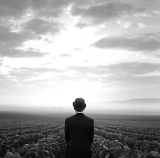
Rodney Smith studied photography at Yale under Walker Evans before receiving a fellowship, which allowed him to travel to Jerusalem. After publishing a book compiled of images from this journey called “The Land of Light,” Smith was asked to lecture at many prestigious universities, all of which he declined. Instead, Smith found himself “riding slow trains in India, bicycling through the Camarque, strolling the streets of Paris.” Eventually, Smith returned to Yale to earn a degree in Divinity (of all things).
“Today, Rodney is a celebrated photographer with a wonderful breadth of subject matter and feeling. He’s had dozens of shows. Won 75 awards. Is collected by Carnegies, Whitneys and Rockefellars, plus, scads of orchestra and museum patrons and a few enlightened rock stars…His work is represented in every important gallery across the globe…”
There is great mystery about Rodney Smith that one could argue he reveals-and at the same time conceals-in his photography. I enjoy following his hatted friend(s) through woods, fields, over fences and up tall trees-though-I have no idea what he’s up to and how he got there. The narrative and escapist qualities of his work along with the repetition of a man and his hat lead me to believe that this obscure figure is how Smith perceives himself. Or the man he wishes he could be.
I don’t know how I didn’t come across Smith’s work earlier. The parallels that I enjoy drawing between my work and Smith’s is that there is a considerable amount of mystery in our images that both reveal and conceal our intentions or concept not only as photographers and artists, but as who we are mentally and emotionally. Unfortunately, it would’ve been more helpful earlier in the semester to view his work, as I was heavily considering how to vary my own while using the same subject matter repeatedly. Though, fortunately, I am still inspired by his work and can apply to my own in other areas such as composition, lighting, and posing.
I have not mentioned the fashion-esque aspects of Smith’s work; at first fashion was something I was inclined to incorporate into my images, but over time that slowly started to dissolve. Having not considered it in a while, I decided that that wasn’t something I wanted to include in my images. However, I’ve now realized that it is part of my style and I do it somewhat subconsciously. Smith’s work seems much the same. Looking at his work that follows around the man with the hat next to his fashion photography, I can easily observe similarities between the two in much of the same areas as listed above. And, at points, these two bodies of work appear to slip into each other: a clever facet of Smith’s portfolio.
Thursday, March 25, 2010
Idea Blog for 03/25

Thursday, March 11, 2010
Visiting Artist, Kerry McDonnell, 03/11
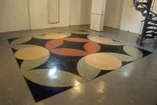
I thought his first piece (Mandala of the B-Bodhisattva II) was the most accessible. It incorporates all of the major elements his work is influenced by. The piece is a 16x16 foot hand-carved linoleum mat meant to represent a Mandala. The mat was originally used for a dance competition and was later shown (scuff-marks and all) in several museums where time was allotted for people to dance on it. Biggers made an interesting point that, while the pattern of the mat is referencing a Mandala (used in Buddhist rituals/meditation), the dancers approached the mat as though it were actually a religious or sacred space. Another piece called Constellation was interesting, but required quite a bit of explanation. For this work, Biggers created “star maps” that are actually maps of the Underground Railroad in several large cities; the stars reference the major safe-houses along the way, becoming brighter with each place’s significance.
I have to say I was a little bit lost whilst listening to Biggers’ lecture. He seemed to jump around quite a bit and I found it conceptually difficult to follow. After having gone to the lecture and before reading further about Biggers’ work, I was frankly not entirely sure what to think of it all. I understood the references to urban culture and his Buddhist influence, but I suppose I wasn’t sure what I was supposed to be taking away from his lecture; I suppose his work’s purpose was lost in communication.
Sunday, March 7, 2010
Artist Blog for 03/08
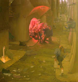
Inka Essenhigh is a painter based in NY. She studied at the Columbus College of Art and Design in Ohio and the School of Visual Arts in New York. Her work has been shown around the world including the Royal Academy in London, the San Francisco Museum of Modern Art, and MOMA New York.
Essenhigh pulls inspiration from oriental art, 19th century caricatures and contemporary comics, among many others. Patricia Ellis describes Essenhigh’s paintings as “both exotic and operatic: envisioning futuristic mythologies frozen in dynamic moments of suspended animation.” What is most interesting about Essenhigh’s work is that it fluctuates between abstraction and representation. The glossy finishes of her more recent paintings create a sense of “hyper-artificiality.” They reference the perfection of 3D animation and virtual reality. Ellis goes on to say: “Inka Essenhigh's paintings overtly celebrate their superficiality, embracing humour, violence and chaos, within their vapid, magnetic allure. Inka Essenhigh conceives her paintings as being quintessentially American; a brand of futurism that's instantly attractive and sublimely infinite.”
Essenhigh’s paintings are immediately attractive. Her use of color and the fluidity of her subject matter is instantly gratifying in that it’s easy on the eyes. I am effortlessly lost in her work, contemplating the multiple possibilities of what direction her tableaux’s will take. Her work seems to reference an invented mythology or legend. However, specific event(s) her work is referencing seems not to matter; her invented mythology seems more of a back-story, letting the beauty of her style speak for itself. I envy Essenhigh’s style and envy her ability to draw attention to her work through her aesthetic. I strive to achieve that in my own work and can appreciate and pull inspiration from Essenhigh’s capability to do so.
Wednesday, March 3, 2010
Idea Blog for 03/04
I kind of wanted to wait to do this blog post so I could review the recording of my midterm critique and comment on it, but I suppose I can do that on my own time afterwards, anyway. I don’t really have all that much to say at this point. I suppose I could recap all the supporting research I’ve done, just to have it all in one place. Yeah, I think I’ll do just that.
The crown traditionally represents power, legitimacy, immortality, righteousness, victory, triumph, resurrection, honor, and perfection. It can also be used with irony; worn by jesters, fools and pretenders.
The color orange (in the context of family crests) represents ambition.
Neurosis: Neurosis is the way of avoiding non-being by avoiding being ~Paul Tillich. With the threat of non-being, the Neurotic is often creative in his attempts to deal with it by creating an “imaginary world” for himself.
Neurosis represents a variety of mental disorders in which emotional distress or unconscious conflict is expressed through various physical physiological and mental disturbances, which may include physical symptoms like hysteria. The definitive symptom being anxieties. Neurotic tendencies are common and may manifest themselves as depression, acute or chronic anxiety, obsessive-compulsive tendencies, phobias and even personality disorders such as borderline personality disorder or obsessive-compulsive personality disorder (OCPD).
Simply defined, Neurosis is a “poor ability” to adapt to one’s environment and an inability to change one’s life patterns.
Struggle is what keeps a child from feeling his hopelessness. It lies in overwork, in slaving for high grades, in being the performer. Struggle is the Neurotic’s hope of being loved. Instead of being himself, he struggles to become another version of himself. Sooner or later the child comes to believe that this version is the real him. The ‘act’ is no longer voluntary and conscious; it is automatic and unconscious. It is neurotic. ~Dr. Arthur Janov, Neurosis
Symptoms of OCPD are anxieties, obsession of cleanliness and organization, perfectionism, rigid moral or ethical values and disinhibition (A term in psychology used to describe a lack of restraint manifested in several ways, including disregard for social conventions, impulsivity, and poor risk assessment. Disinhibition affects motor, instinctual, emotional, cognitive and perceptual aspects.)
Now, to explain all this: My dad suffers from OCPD and I’m convinced (though haven’t been diagnosed, and for that matter I don’t think I need to be—I see enough of myself in him to just know) that I suffer from it as well. The crown is the perfect metaphor for the versions of herself my sister is assuming, not to mention that it sits on the head, thus acknowledging the mental disorder (OCPD) and their connection to perfection or perfectionism. The symbolism of the color orange also relates to form(s) of neurosis or the Neurotic in that it stands for an ambition to become something greater: a bigger, better self. Consequently, the person taking on these other selves is so they can escape the life they belong to realistically; reconstructing things they’ve been denied as who they really are as how they wish they could-or should-be. In my attempts to escape the issues at home, (I) Hayley has physically and mentally removed herself from her home and family. In a sense, she is allowing herself to exist in her own mind.
I think that covers everything! I hope that all makes sense.


